
Business cards remain useful wherever personal introductions matter. They are exchanged during meetings, sales visits, exhibitions, property discussions, professional consultations and networking events. Yet two cards containing identical information can create very different impressions because of paper and finishing choices. For businesses comparing business card printing in Nagpur, understanding these differences helps avoid choosing a finish based only on appearance.
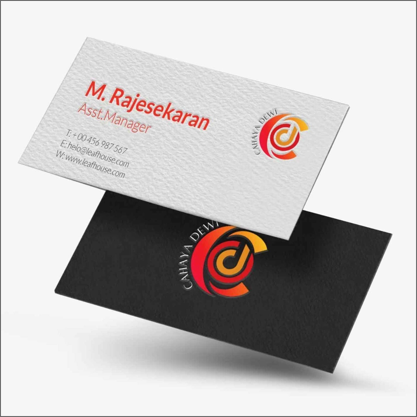
A matte finish generally creates a restrained, professional appearance. It can work well for consultants, architects, healthcare professionals, corporate executives and brands that prefer understated visual communication. Matte surfaces also tend to reduce glare, making information easier to view under bright lighting.
Glossy finishes emphasise colour and imagery. They can be suitable for businesses using photographs, vivid graphics or highly saturated branding. Restaurants, travel businesses, creative services and certain retail categories may prefer this visual impact.
Premium finishes cover a broader range of options. Depending on the printing specification, these may involve heavier stocks, textured materials, selective finishing or other enhancements. Premium does not automatically mean better. The finish should support the brand rather than overpower the information.
When comparing options, consider:
Readability: Can the name, designation and contact details be read immediately?
Brand character: Does the finish match how the business wants to be perceived?
Handling: Will the surface withstand frequent storage in wallets and card holders?
Colour reproduction: Does the selected material complement the brand palette?
Budget per card: Is the added finishing meaningful enough to justify its cost?
Quantity: Is the same specification practical for the entire required print run?
Design matters just as much as finishing. A premium stock cannot fix overcrowded artwork. Essential information usually includes the person's name, role, company identity and appropriate contact details. Additional information should be included only when it serves a clear purpose.
Businesses sometimes reduce the font size excessively to fit more information. This can make the card difficult to read and weaken its usefulness. Another common issue is poor contrast, such as light text over a complicated image.
In Nagpur's professional and commercial market, cards may be exchanged across industries ranging from manufacturing and real estate to healthcare, retail and business services. The right specification therefore depends heavily on the audience.
Cost should be evaluated as part of the complete requirement. A business ordering cards for a large sales team may prioritise consistency and economical repeat production. A senior consultant ordering a smaller quantity may place greater emphasis on distinctive materials and finishing.
IMAGINATION offers business card design and printing in Nagpur, allowing organisations to consider artwork, stock and finishing as parts of the same production decision.
The best business card is not necessarily the thickest, glossiest or most elaborate. It is one that communicates essential information immediately, feels appropriate for the organisation and remains consistent with other brand materials. Comparing finishes against these criteria makes the selection process far more useful than choosing from samples based on visual appeal alone.